
Choosing a color palette for your home might seem like a matter of taste, but it’s much more than that. The colors you live with every day influence your mood, the perceived size of your space, and the overall energy that flows through your rooms. Whether you’re moving into a new place or updating your current one, understanding how to select the right shades can transform your house into a cohesive and inviting home.
Why Color Palette Matters in Home Design
Color is deeply emotional. It can calm us down, energize us, or even stimulate creativity without us realizing it. Walking into a room painted in soft greens and blues tends to soothe the mind, while vibrant oranges or reds can awaken your senses and make a space feel lively. Each shade carries a psychological weight, and when used correctly, color can support the intended purpose of any space.
More than mood, color affects function. A home office with crisp whites or pale blues might help improve focus, while a dining area bathed in warm tones can encourage longer conversations and a sense of comfort. Even how big or small a room feels can be influenced by your palette—lighter colors reflect more light and create a sense of openness, while darker tones pull the walls inward and foster intimacy.
Understanding Your Home’s Natural Features
Before reaching for the paintbrush, consider the natural elements of your home that you can’t (or don’t want to) change. Sunlight plays a major role in how a color appears. A soft beige might look creamy in the morning sun but lean toward gray under artificial lighting in the evening. Each room’s orientation—whether it faces north, south, east, or west—also alters how light interacts with the walls.
Beyond lighting, the fixed features of your home—such as the floor color, the finish on your cabinetry, or any architectural details like exposed beams—serve as visual anchors. They often dictate the range of hues that will blend or clash, making it essential to work with what’s already there rather than against it.
Designing with Mood and Purpose in Mind
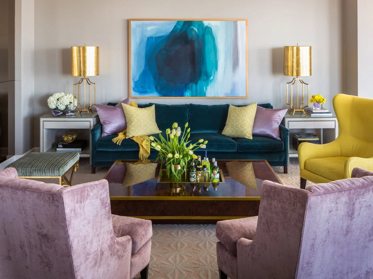
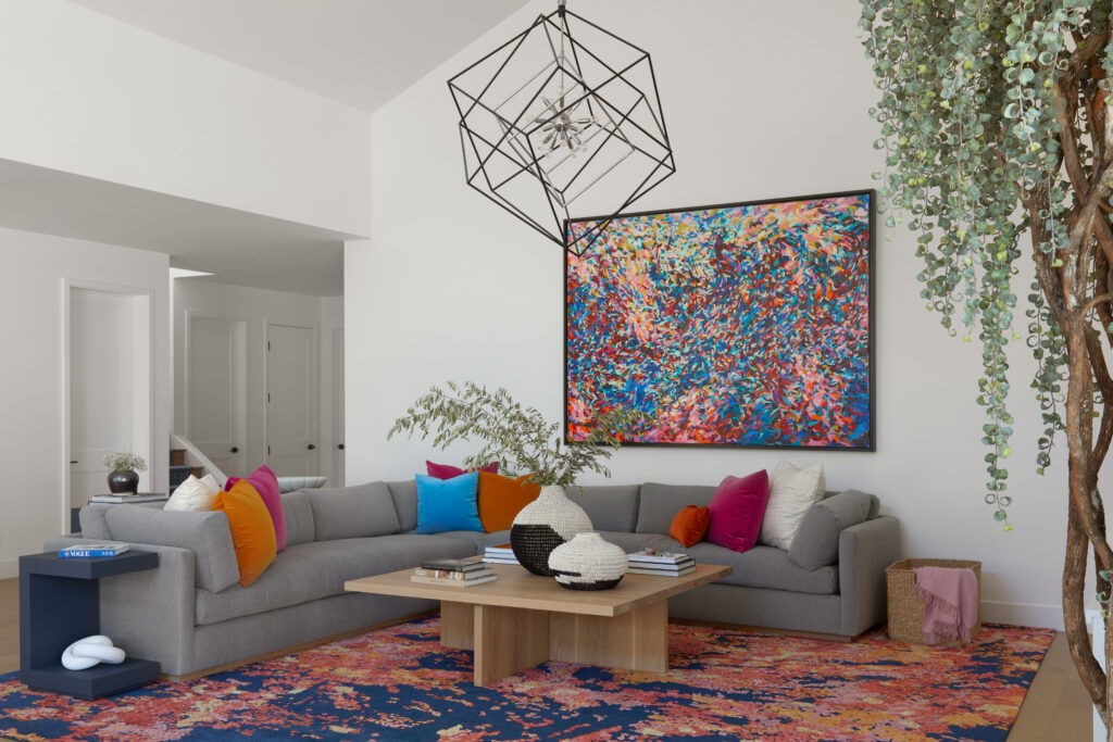
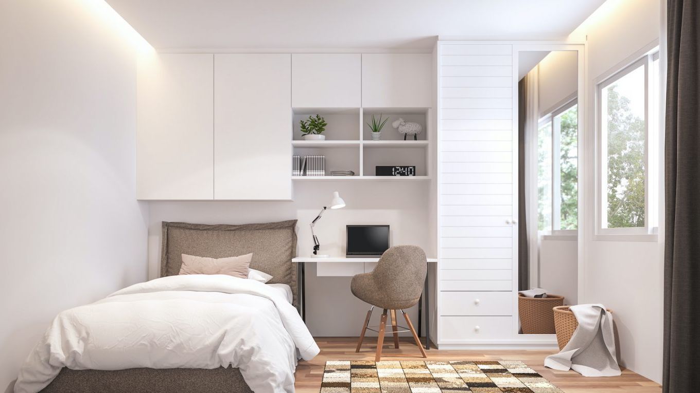
Think about how you want each room to feel. A bedroom, ideally a restful retreat, benefits from soft, muted tones that create serenity. On the other hand, living areas or kitchens might be better suited to bolder, more vibrant colors that make the space feel energetic and social.
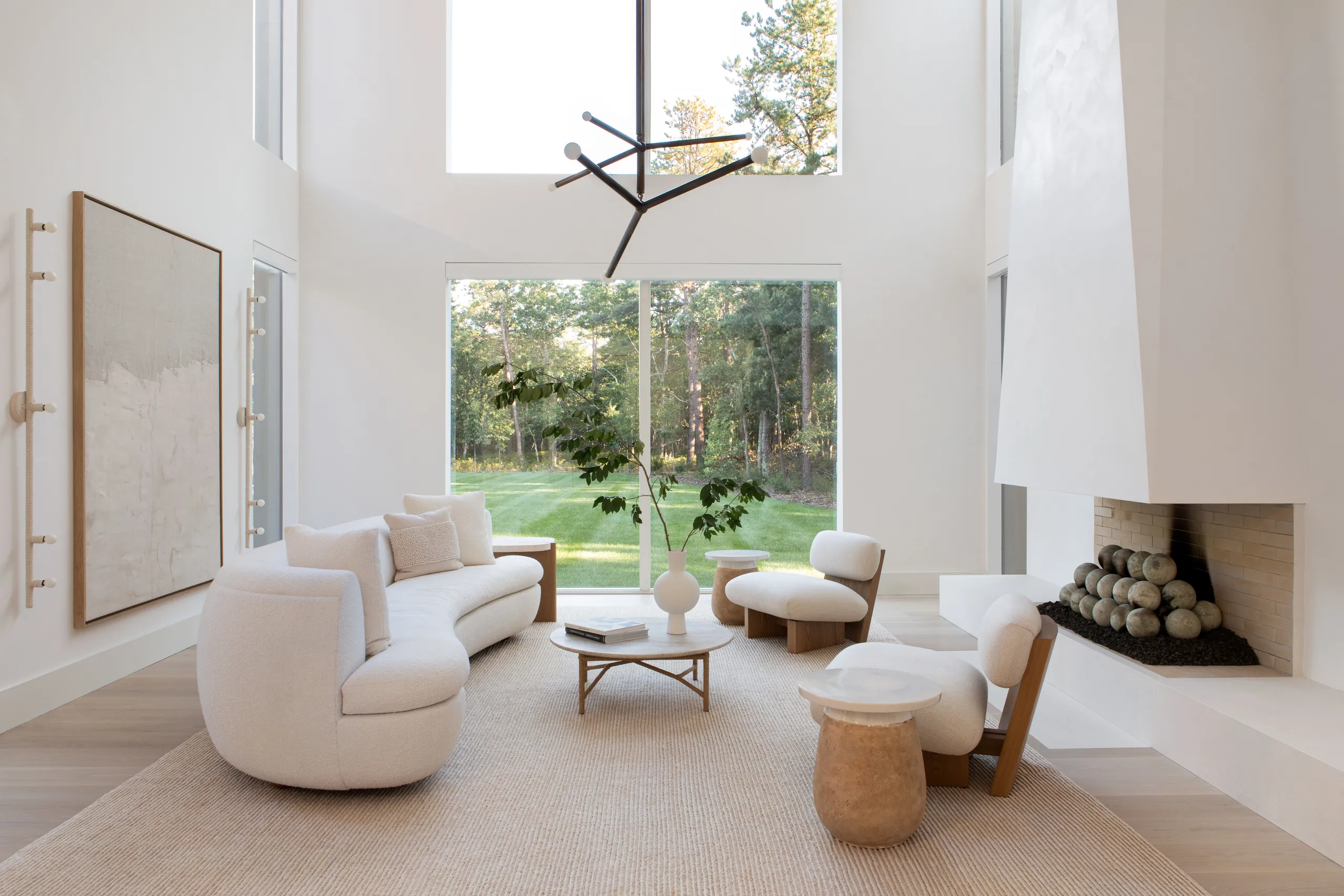
Neutral palettes can serve as a great foundation, especially in multi-use spaces. These tones provide flexibility and timelessness, allowing you to swap out accents like cushions, curtains, or artwork as your taste evolves, without the need for a complete makeover.
Color Theory: A Simple Foundation
While you don’t need to be a designer to use color well, having a basic understanding of color theory helps. Warm colors like reds, yellows, and terracottas tend to advance in space, bringing a sense of coziness and intimacy. Cool colors—think blues, greens, and soft purples—recede and can make a room feel larger and more peaceful.
Balance is essential. Too many similar tones can feel flat, while too much contrast might overwhelm. One helpful principle to guide your choices is the idea of visual hierarchy. You might have a dominant shade that sets the tone, supported by secondary colors and punctuated with subtle accents.
Starting with a Base and Building Out
A good starting point is often something you already love. This might be a patterned rug, a favorite piece of artwork, or even a beloved item of furniture. Use this as your foundation and pull complementary colors from it. From there, you can build a palette that feels natural and connected.
When you begin layering colors, consider how they work not just in isolation but across the whole home. Using similar undertones or repeating key elements from one room to the next will help your space feel united without becoming monotonous.
Exploring Style Through Color
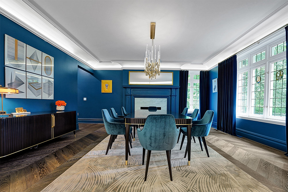
Your personal style should shine through your palette. If you lean toward modern minimalism, monochromatic schemes with bold black or navy accents can create a striking look. A coastal vibe might call for breezy whites, soft blues, and sandy beige tones. For something more grounded and natural, earthy greens, rusts, and deep browns bring warmth and authenticity.
These stylistic cues not only guide your color choices but also influence the textures and materials that support them, helping to create a full sensory experience.
Making Confident Decisions
Once you’ve settled on a few possible colors, don’t rush into painting. Try samples directly on the wall or use peel-and-stick swatches, and observe how they look throughout the day. Lighting changes everything—what appears muted in the morning might become too intense at night. Giving yourself a few days to live with a color will help ensure you’re making a choice you’ll love long-term.
It’s also helpful to walk through your home and observe how colors will transition from room to room. Even if each space has its own personality, there should be a common thread that ties everything together.
Finding Support in Tools and Professionals
Technology can make the process easier. There are many free online tools that generate palettes based on a single color or image. Visualization apps allow you to preview what your space would look like with different shades, helping you avoid costly mistakes.
And if you’re still unsure, a color consultant or interior designer can provide a professional perspective. Their experience with space, light, and materials can save you time—and help you avoid second-guessing.
Creating Cohesion Throughout Your Home
Color has the power to unify your entire home. Repeating certain hues, even subtly, helps create visual flow. You might paint one room a soft olive green and use that same shade in throw pillows in an adjacent space. Or perhaps your baseboards and trim share the same warm white throughout, tying together otherwise distinct rooms.
While it’s important to aim for harmony, don’t be afraid to take risks. A powder room might become the perfect place to play with a dramatic hue or pattern that would be overwhelming in a larger space. Rules are helpful, but ultimately, your home should reflect you—and that sometimes means bending the rules to suit your vision.
Leave a Reply